Androidタブレット用アプリ UIデザイン
App for Android Tablet UI Design
介護施設用タブレットアプリ
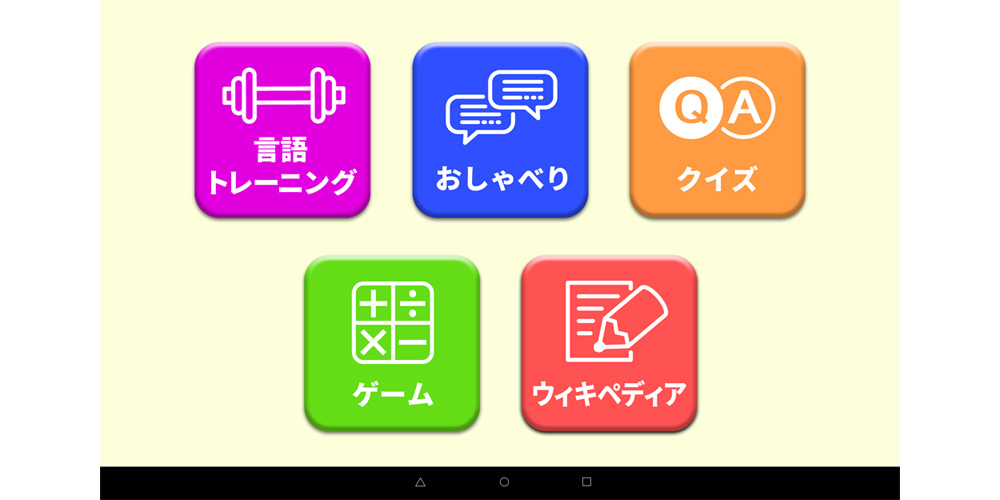
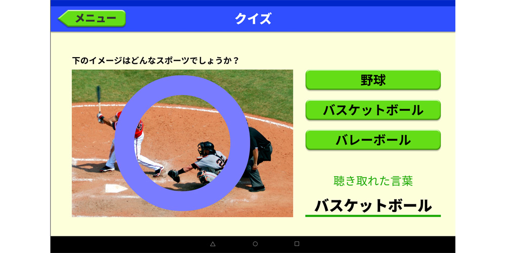
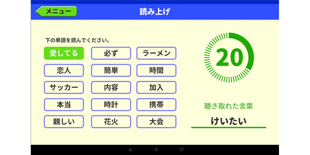
介護施設入居者用のAndroidタブレット端末専用アプリのUIデザインを担当しました。
通常のアプリ・デザインとの大きな違いは、視力や反応力が弱いユーザーを対象にしているため、使用する色のコントラストを強く、色だけでも判別できるように、またボタンを識別しやすいように工夫をしました。現在一般的なWEBやアプリのデザインではフラットなデザインが主流ですが、先述した理由により、よりボタンか否かを判別できるよう、ボタンには強いエンボスと影を付け、大きくし使用する色も判別しやすいようにカラフルにしています。ボタンの間を大きく空け、なるべく誤動作を防ぐ工夫もしています。
主要担当部分
- UIデザイン(Figma)
Tablet Application for Care Facilities
I was responsible for the UI design of an Android tablet application specifically developed for residents in care facilities. Unlike typical app designs, this project required special considerations for users with impaired vision and slower response times. To accommodate these needs, I emphasized strong color contrast to ensure elements could be distinguished by color alone. Buttons were designed with clear identification in mind, featuring bold embossing, shadows, larger sizes, and vibrant colors to enhance visibility. Additionally, I spaced buttons widely apart to minimize accidental operations and improve usability.
Key Responsibilities:
- UI Design(Figma)