スマートフォン・アプリ UIデザイン
App UI design for Smartphone
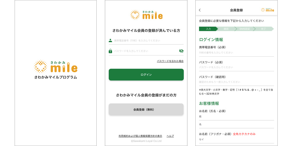
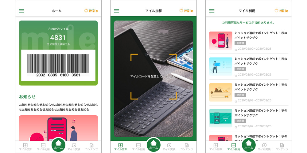
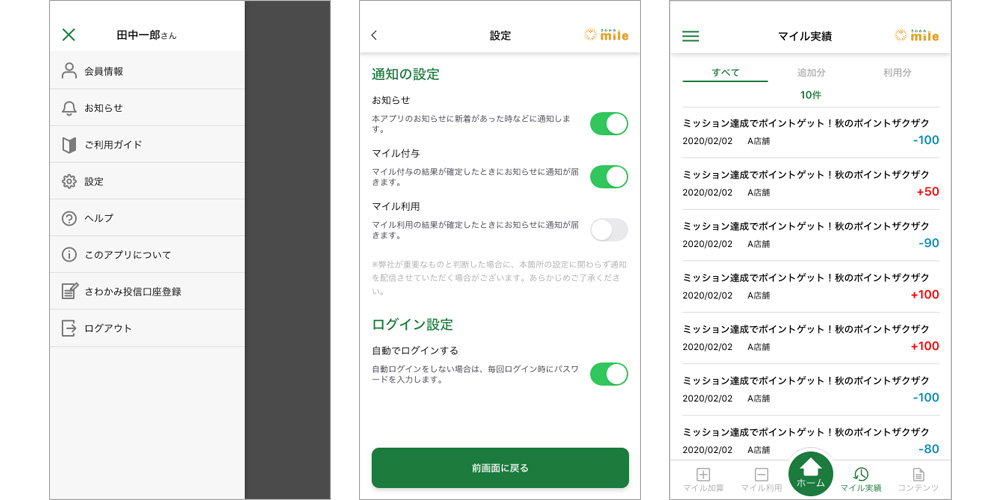
金融系スマートフォンアプリ
スプラッシュ画面、ログイン、会員登録、お知らせ、コンテンツ、ヘルプ画面などアプリの主要画面デザインを担当しました。色はサービスのキーカラー(緑とオレンジ)を基本に、UIはシンプルで見やすく、同傾向のアプリデザインと大きく乖離することなく、操作も分かりやすいデザインを目ざしました。
主要担当部分
- UIデザイン(Adobe XD)
- プロトタイプ制作(Adobe XD)
Finance Smartphone App
I was responsible for designing the key screens of the app, including the splash screen, login, member registration, notifications, content, and help screens. The design was based on the service's key color (green and orange) and aimed for a simple and visually accessible UI. The goal was to create an intuitive user experience that aligns with similar app designs in the financial sector while maintaining ease of use.
Key Responsibilities:
- UI Design (Adobe XD)
- Prototype Creation (Adobe XD)