Web アプリ HTMLコーディング
Web App HTML Coding
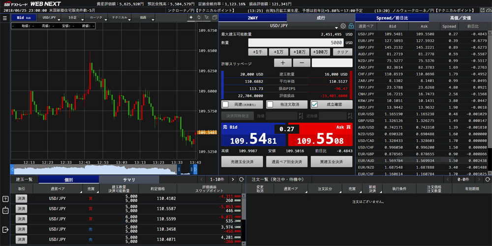
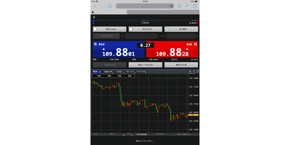
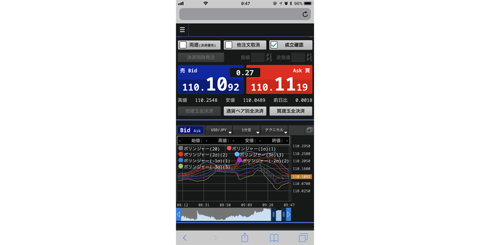
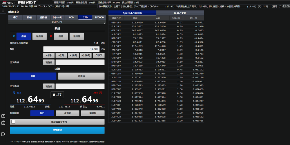
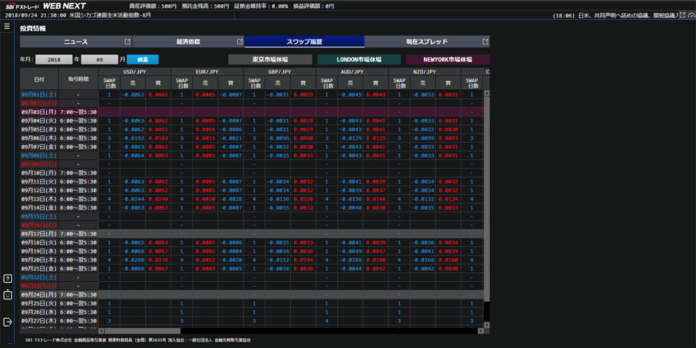

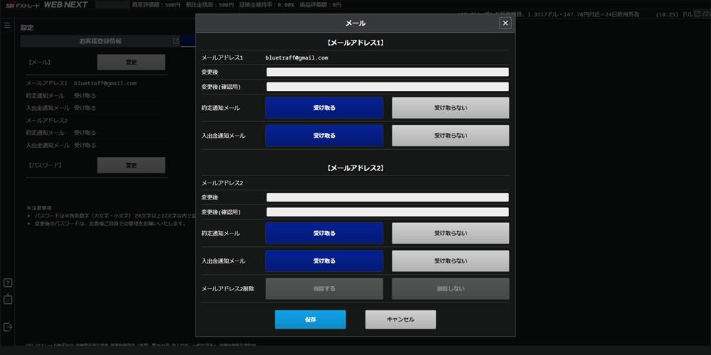
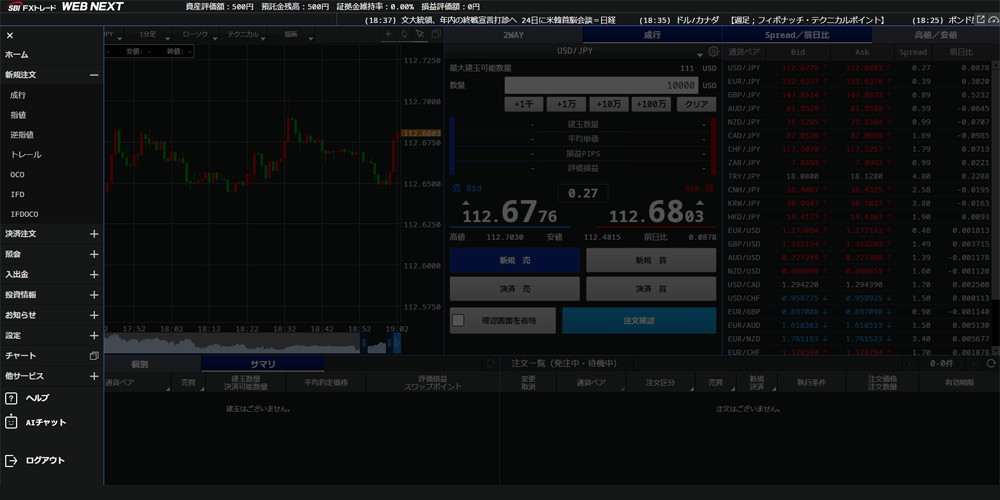
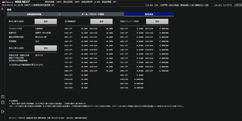
金融系 Webアプリケーション
PC、スマートフォン、タブレット多種なデバイスに対応したレスポンシブデザインでのコーディングを担当しました。アイコン以外の画像は一切使わずすべてCSSで表現しています。またクライアントからの要望によりデバイス(ブラウザ)の幅によりフォントのサイズが変化するようにCSSを設定してます。また細かなコンテンツがぎっしりと詰まっており、その点ではコーディングに苦労した案件です。
主要担当部分
- HTMLコーディング
- Bootstrap
Financial Web Application
I was responsible for coding a responsive design that supports various devices, including PCs, smartphones, and tablets. All visual elements, except for icons, were created entirely using CSS without relying on images. Additionally, I configured CSS to adjust font sizes dynamically based on the width of the device (browser) as per the client's request. This project was particularly challenging due to the densely packed content requiring meticulous coding.
Key Responsibilities:
- HTML Coding
- Bootstrap